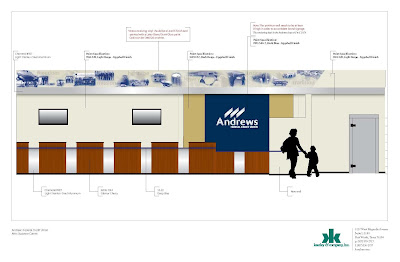
Image of a retail schematic for Andrews FCU
There seems to be some general confusion about what exactly retail merchandising/visual merchandising is. Ask most people, and their response is something along the lines of 'interior design for a business.' They aren't wrong--but that is just the surface.
I found a blog on ddionline.com that described it very eloquently, so I thought I'd share it here.
"To me, successful visual merchandising is a pragmatic balance of art and science and should be, in many instances, weighted more heavily on the science side. I commonly use the analogy of a cupcake to describe this balance. The bottom portion of the cupcake represents the science, or the primary foundation of visual merchandising: space planning, product placement, adjacencies and organization. It is the general merchandising framework of standards, systematic practices and planning that creates this foundation. The top portion of the cupcake—the frosting—represents the art form, the display and appeal that helps to attract and differentiate. You need the solid foundation of the cake (the science) to support the frosting (the art). Since it is front and center, most people see the frosting only—which is good, but to successfully leverage the true function of visual merchandising, you must apply the framework of the science behind it. Visual merchandising creates the in-store experience. It is a 3-D expression of the brand. It creates organizational efficiencies and ultimately motivates purchase decisions that result in sales. Bottom line, effective visual merchandising is intended to create a positive customer experience that drives sales."
Read the full article here.
